
Model Calibration
EE has been designed to quickly generate report-quality plots of model-to-data comparisons and model results statistics. EE gives you the tools to link the appropriate model cells and layers to each specific data set. These links are then saved in the model configuration files for use in any subsequent model run. You can disable or enable each linkage to report only what you need for the current calibration stage. You can run each of these tools manually at any time or can configure EE to automatically generate these plots and statistics at the end of the run.
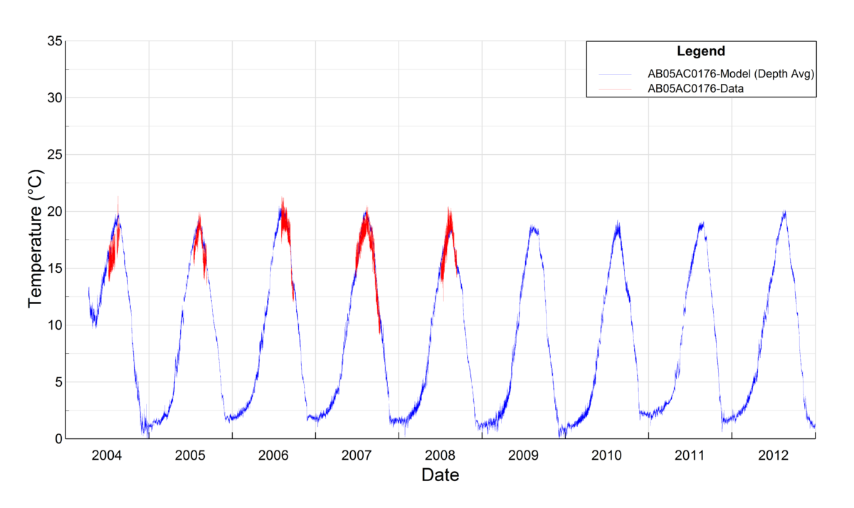
Time Series Plots
You can configure Time Series comparison plots to link observed data to the predicted model values. The example here shows observed temperature data compared with simulated temperatures modeled with EFDC+.
Calibration Statistics
EE can automatically generate a wide range of statistical metrics for each configured station, including, for example: Average Error, Relative Error, Average Absolute Error, Root Mean Square Error, and the Nash-Sutcliffe coefficient. Using EE, you can output these metrics in summary formats that can be easily imported into Excel or Word for reporting purposes.
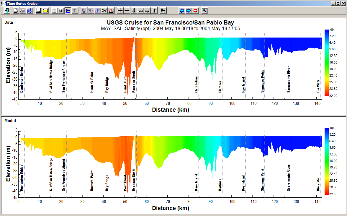
Cruise Plots
For large water bodies such as the San Francisco Bay and Delta, data is often routinely collected from a single moving boat or “cruise”. This produces a data set that is spatially and temporally variable for a single “cruise.” EE can provide you a visual comparison of these data to the model results by defining a “cruise line” that corresponds to a transect of data sampled on the waterbody. To create such a Cruise Plot, EE extracts the model data from the user-defined line at the specific time of data collection at that point and compares this information with the measured data.
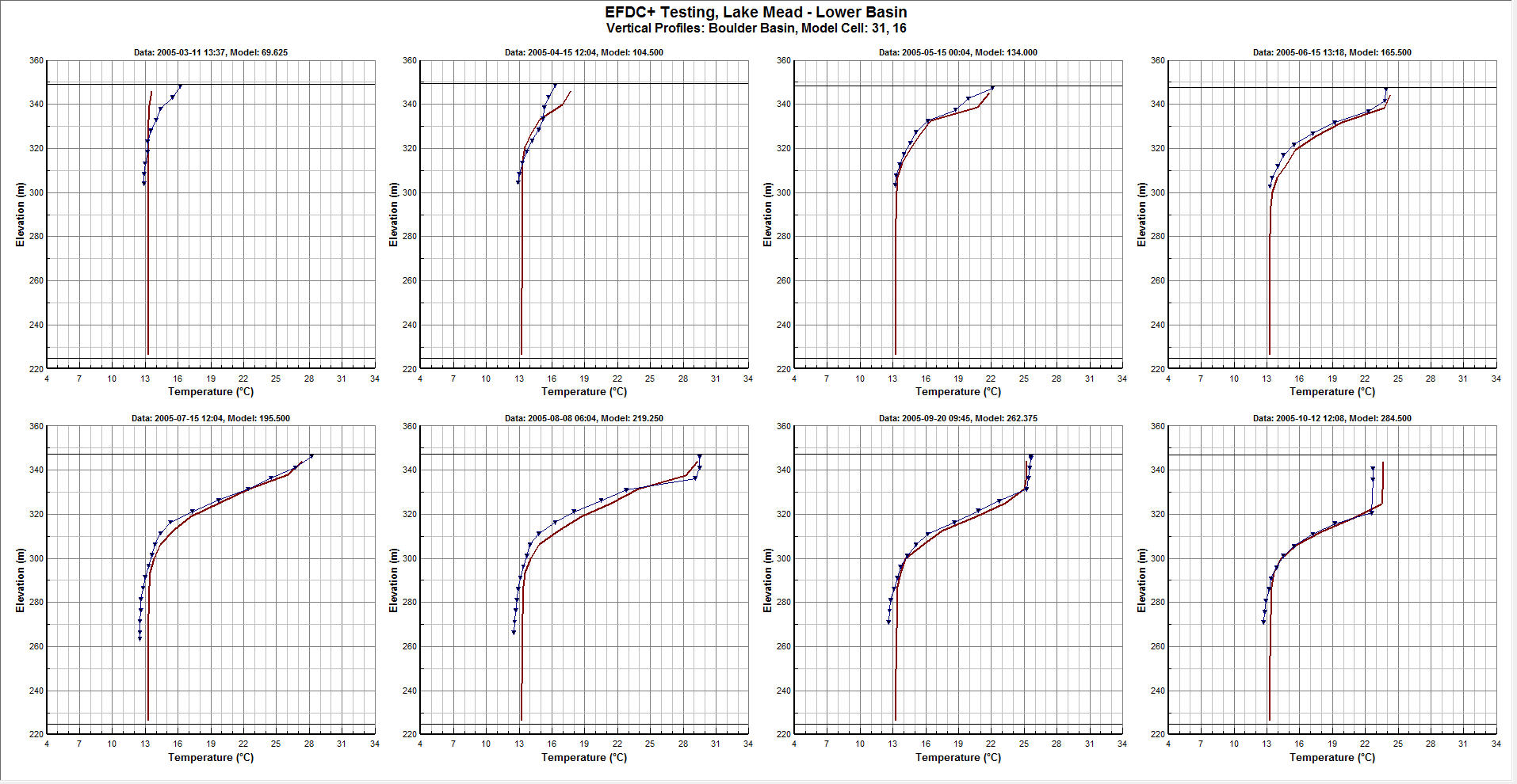
Vertical Profile Plots
Vertical profile plots are essential in developing calibrated models where there is significant stratification in the water column. EE can show a comparison between modeled and observed data with multiple model-data vertical profiles on each page.
Correlation Plots
EE can plot correlations between the model and measured data, optionally displaying correlation coefficient and other statistics on each plot. An example of a model-data correlation plot comparison for water surface elevation is shown below, with the observed data shown on the x-axis and the model results shown on the y-axis.
Flux Plots
The flux comparison tool is provided to help you calibrate flow or constituent flux across a user-defined cross section. Any number of cross sections can be used to generate time series comparisons between measured and modeled flows.